5 Things You Must Do to Prepare For the New YouTube One Channel Layout 2013

new-youtube-one-channel-layout.jpg

The new YouTube One Channel layout has been available for a month or two now, but only on an opt in basis. Over 100 million users have already made the switch, but from June 5th, all channels will be automatically and permanently moved to the new design, whether they're ready for it or not! The last thing you want is for your channel and its branding to look out of sorts when the switch happens, so here are 5 Things You Must Do to Prepare For the YouTube One Channel Layout. These simple steps to get yourself ready ahead of time and take advantage of the benefits of the new layout as soon as possible.

1. Opt In Now

opt-in.JPG

To be ready before the automatic switchover (and make use of the next four pointers), opt in to the YouTube One Channel layout now by visiting http://www.youtube.com/onechannel. Have a read through the overview provided if you wish, bid farewell to your old channel layout one last time, then hit the button at the bottom of the page to upgrade.

2. Upload A Channel Icon

500socialmedia-1354822281_600.jpg

Once you're upgraded, upload a square, high-resolution (800px x 800px) image for your channel icon; a pic that is also recognisable at smaller resolutions. This image will be your channel’s icon all over YouTube - in search results, comments, and on your Channel Art (explained next).

3. Upload Channel Art

youtube-channel-art-example.JPG

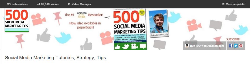
The One Channel design ditches the background branding of old and opts instead for a simple cover image known as your Channel Art. Your YouTube channel's icon sits on top of it, and you can also add clickable icons to your website and social media profiles. To get started, hover over your channel art place holder and click the pencil icon that appears in the top-right corner. In the drop-down menu, click "Edit Channel Art" and "Edit Links" respectively.

The most effective YouTube Channel Art is an image that is optimised to display well on whichever resolution it is being viewed. To ensure yours looks great on screens from mobiles to HD televisions, use the guidelines in my template, which you can download here: Social Media Templates Page

4. Create A Channel Trailer


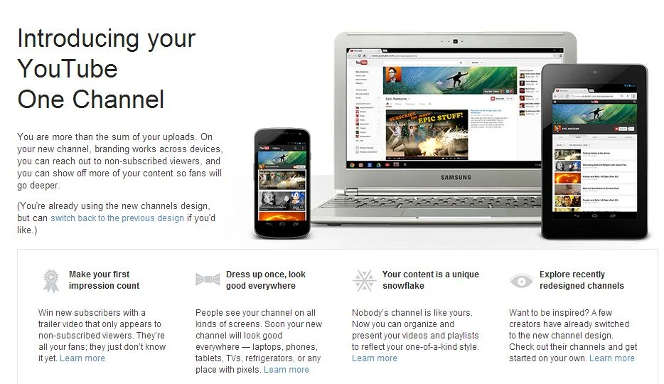
The new YouTube channel pages have two primary ways of displaying video content in the Home tab: through the Browse view or through the Activity Feed. The Activity Feed broadcasts your activity on YouTube to your subscribers, while the Browse view two different "sub-views": a view for subscribers, and a view for viewers who have not yet subscribed to your channel. For this reason, the Browse view is my preferred default, but it needs to be enabled first. Here's how:

1. Hover your cursor over the menu bar that contains the 'Video', 'About', and 'Discussion' tabs on your Channel Page.

2. Click on the pencil icon that appears to open the Channel Navigation menu.

3. From here, click the button to enable the Browse feed, and then click Save. Go back to your Channel page and you'll be able to add a trailer over a place holder.

For instructions about how to create a great channel trailer to entice in new subscribers, watch my tutorial video above. 

5. Add Sections

sections.JPG

Sections are a way for you to organise your videos into groups on your channel page, and they can either be built manually or created dynamically from video tags, likes, etc. Use sections to highlight your best content, both to subscribed and non-subscribed viewers. To begin, scroll to the bottom of your channel page and click the "Add a section" button.

Conclusion

So there you have it, a handful of simple and effective ways you can help make your brand's transition to the YouTube One Channel layout as painless as possible, and hopefully increase your audience at the same time. What are your thoughts on the new YouTube layout? Let me know in the comments below!


FREE YouTube Subscribe Button PSD 2013 - Large Size Download

 
youtube-subscribe-button-download-2013-free-large.jpg

For some time now, YouTube has been sporting a new "Subscribe"  button on the site. Gone is the bright yellow, and in is a more stylish grey and red design that more closely matches the site's design.

old-new.jpg

A lot of people (including myself) place a Subscribe button at the end screen of their videos, and overlay it with a spotlight annotation to encourage viewers to subscribe to their channel. Only problem is, there didn't seem to be a nice, big version of the new Subscribe button design around to use. So with the tiny "Subscribe" button from a YouTube video page and a little Photoshop magic, I designed one myself - a large YouTube Subscribe button for 2013. 

Here's the original (120 x 26 pixels):  


youtube-subscribe-button-original.png

And here's my copycat attempt (2496 x 530 pixels): 

I'll be the first to admit that the image isn't an exact  copy... unfortunately my Photoshop skills don't extend that far at present, but it's pretty similar, and certainly better than the big ol' yellow monstrosity I'm using at the moment! Feel free to right-click and Save this image for use in your own YouTube videos or download the transparent PSD file from the following link:

http://min.us/lbcP6SNiSAQeNW  - hover your mouse over the image and click the 'Download' icon.  Link down? Tweet me @500socialmedia and I'll upload a new one!

If you know someone else who might benefit from this button, please share it with them. 

Example


Here's how the Subscribe button looks on my current YouTube end-screen. I hope you'll use it on yours too! 


ABOUT THE AUTHOR

Andrew Macarthy is the author of the #1 Amazon Bestseller, 500 Social Media Marketing Tips.

Buy 500 Social Media Marketing Tips (Kindle or Paperback)
Amazon US: http://www.amazon.com/dp/B007L50HE6
Amazon UK: http://www.amazon.co.uk/dp/B007L50HE6

Follow Me:
http://www.facebook.com/500socialmediatips/
https://pinterest.com/500socialmedia/
http://www.twitter.com/500socialmedia
http://www.youtube.com/500socialmediatips

Social Media Templates 2014, 2015 PSD | Facebook, Twitter, Google Plus, YouTube One Channel

 
social-media-templates-2013-2014.jpg

Introduction

I've previously posted several social media templates in individual blog posts, but I think it would probably be more handy for you guys to be able to grab them all in one spot. This also means that I can easily update the templates and links should the designs change - as we know they often do!  

The templates for Facebook, Twitter, Google+, and YouTube are in the .psd file format, which can be opened and edited in Photoshop or GIMP (a free photo editing program).  Each template includes simple instructions for where your design should be placed in order to be viewed optimally on each site.  

Want me to build and design your social profiles? 

Even with the templates below, I understand that designing and building great social media branding can be tricky, especially if you have never used Photoshop or don't have the time to do the work due to a busy schedule... that's where I can help!

If you'd like me to create your social media branding for Facebook, Twitter, YouTube, and more, purchase via PayPal below (no PayPal account required) or get in touch via the Contact Me page. I'll get back to you shortly afterwards to find out about your requirements.


Purchase Options

Facebook Cover Photo Template

facebook-cover-photo-template-2.jpg

This is the basic Facebook cover photo template. It'll help you create a design that is optimised for desktops and ensure that your profile photo doesn't obscure any of your design's most important information. For more information and detailed instructions for using this template, click here

Facebook Cover Photo Template Optimised for Desktop and Mobile


This template takes into account the appearance of cover photos and profile photos on the Facebook mobile app and is recommended for those who want to super optimise their Facebook Page. For more information and real-life examples, click here.

Twitter Background Image Template

To get the most out of the Twitter Background Image template, i.e. to optimise it for viewing by all Twitter users, I urge you to read this blog post before downloading:  http://andrewmacarthy.com/andrew-macarthy-social-media/free-twitter-background-template-psd-2013-1920-x-1200

Twitter Header Image Template

This template will help you brand your Twitter header photo without having any of your most important design elements be hidden by your profile photo, name, bio, etc. Simply add your design to the grey areas and remove all of the template layers before saving. If you would like to create a seamless header and profile photo on Twitter, click here for instructions:   

Google Plus Cover Photo Template

The Google+ cover photo is massive! This template has the correct dimensions for you and a guide (the green bar) to make sure that none of your design is hidden by a dark grey gradient added to the bottom of all cover photos on Google+. 

Google Plus Profile Photo Template for Square Logos

Google+ doesn't like square logos. Getting one to upload properly is a bit of a nightmare, but this template will help you upload one without it being cropped or chopped off by the default circular profile photo. For more information and step-by-step instructions on using the template, click here


YouTube One Channel Template

This YouTube template will help you create channel art optimised for all devices, from mobile phones all the way up to HDTVs. The different-coloured rectangles represent how much of the design each device will see, while the coloured squares represent the position of your channel icon on different devices. Have your design fill the whole space, but remember that only content in the brown area will be seen by everyone on every device.  For detailed instructions about how to use this template, click here.

Download these templates

All of these templates - expertly measured, simple to use, and up-to-date) is available instantly as a downloadable zip file via the purchase link above. For more information on all my social media templates, click here.

Note: Payment is fast and secure via PayPal, but you do not need a PayPal account to buy and download. 


ABOUT THE AUTHOR

Andrew Macarthy is the author of the #1 Amazon Bestseller, 500 Social Media Marketing Tips.

Buy 500 Social Media Marketing Tips (Kindle or Paperback)
Amazon US: http://www.amazon.com/dp/B007L50HE6
Amazon UK: http://www.amazon.co.uk/dp/B007L50HE6

Follow Me:
http://www.facebook.com/500socialmediatips/
https://pinterest.com/500socialmedia/
http://www.twitter.com/500socialmedia
http://www.youtube.com/500socialmediatips

5 Ways to Use YouTube Annotations Like A Pro | Use YouTube Annotations Effectively

 
​5 Ways to Use YouTube Annotations Like A Pro #youtube #socialmedia

​5 Ways to Use YouTube Annotations Like A Pro #youtube #socialmedia

YouTube Annotations can be a great way improve your video content on the site, whether that be to add an extra layer of detail, to entertain, or to add a clickable call to action. Not all annotations, however, are created equal. Here are five ways to optimise the use of yours, in a way that will enhance your viewers' enjoyment of your videos, instead of turning them away. 

Note: The annotation examples below are demonstrated on top of some of my 'home video' content, but the principles easily apply to business and marketing content.

1. Annotation Duration

youtube-annotation-duration.PNG

Annotations can be displayed on top of a video for as long a time as you choose, and while they can be manually closed by the viewer, you don't want to have to make them resort to this as it will disrupt their viewing experience. Therefore, aim to have your annotations appear onscreen for only as long as it takes to read them. In most cases, this will be no longer than 5-7 seconds.

2. Annotation Size

youtube-annotations-size.PNG

By dragging the edges of your annotation in the editor, you can make them as big or as small as you like. Just because you can make an annotation cover the whole of the screen, however, doesn't mean you should! While you'll want it to be seen, the mere action of it popping up onscreen is enough for the majority of people to notice it. Try to keep your annotations as small and unobtrusive as possible, and also refrain from typing their content in ALL CAPS, as this approach can be considered rude and "shouty" online.

3. Annotation Colour

youtube-annotation-color.PNG

YouTube allows you to set the background and text colour of your annotations, but unless the content of the message is absolutely critical to the video (like explaining a detail you forgot to include during recording), their hues are best left subtle. Bright colours like red, yellow, and green are attention-grabbing, but pale and transparent colours are much classier and are much less likely to spoil a viewer's enjoyment of your video. In short, annotations do not always have to take centre stage.

4. Annotation Placement

youtube-annotation-placement.PNG

As in some of the points above, annotation placement is all about them being as unobtrusive as possible - not like the example above, which completely ruins a cute shot of Jenny the cat! The best placement for annotations is at the left and right sides of the video, near the top of the bottom. Avoid placing annotations in the lower third of the video, as there is a chance that they will be obscured by overlay adverts. 

5. Annotation Numbers

youtube-annotations-number.PNG

In short, the fewer annotations your video needs, the better. If your video ends up looking like the example above, it is bound to be a turn-off for your viewers - displaying multiple annotations at once can be distracting and confusing. There's one exception to this rule, however, and it's one I employ on the "end screen" of my videos. Here, I give viewers to either click a Subscribe button, or to click through to my previous video. 

Conclusion And Over to You

So there you have it, five simple tips for YouTube annotations that won't only enhance your videos, but also ensure that the viewing pleasure of your audience is kept at as high a level as possible. Do you have any other tactics for the optimum use of annotations? Let me know in the comments below! 


ABOUT THE AUTHOR

Andrew Macarthy is the author of the #1 Amazon Bestseller, 500 Social Media Marketing Tips.

Buy 500 Social Media Marketing Tips (Kindle or Paperback)
Amazon US: http://www.amazon.com/dp/B007L50HE6
Amazon UK: http://www.amazon.co.uk/dp/B007L50HE6

Follow Me:
http://www.facebook.com/500socialmediatips/
https://pinterest.com/500socialmedia/
http://www.twitter.com/500socialmedia
http://www.youtube.com/500socialmediatips

One Year Of YouTube Video Marketing: 5 Most Important Lessons Learned

 
youtube-video-marketing-strategy-lessons.jpg

It's nearly been a whole year since I started to create and post videos to YouTube in support of my book, 500 Social Media Marketing Tips. I knew that video, in theory, could be a great tool in helping me promote the book, and that it wouldn't have to take too much time or effort - so with nothing to lose, I began. I can't say for sure how much my YouTube content has impacted the sales of my book, but I do know that it hasn't done any harm, and I even use it as a selling point, shouting about it on 500 Social Media Marketing Tips' front cover.


lifetime-stats.PNG

My first video was posted on April 6, 2012, and as I write my channel's current statistics stand at:

  • 485 Subscribers
  • 63,655 views
  • 53,976 minutes watched

Not spectacular figures by any stretch of the imagination, I know, but not too shabby either. My viewership and subscribe rate has grown in a steady upwards trend since the beginning, and for the past few months my video views have reached over 8,000 per month, with around 70 new subscribers per month too. With all that in mind, here are 5 of the most important lessons I have learnt in the past year of video-making for YouTube. 

1. Be Consistent

Consistency is so important in growing a YouTube audience. Mostly every big YouTube channel sticks to a schedule, and so it's something I've tried to emulate. I post a new video at least once a week, and perhaps up to two or three if the situation calls for it - e.g. reporting on the roll out of Facebook Graph Search or the new YouTube layout just after it's announced. If your audience knows you are going to be posting content on a regular basis, they're more likely to subscribe to be sure not to miss it. And naturally, the more videos you have out there, the more views you will notch up over time.

As a side note on the consistency thing, none of my videos have gone viral, nor does one single video represent the bulk my statistics. In fact, there is less than 3,000 total views between my best-performing and 10th best-performing videos.

2. Offer Value

Many people search YouTube to learn or get help in carrying out certain tasks, and that's what my videos set out to do - offering simple tips and tricks for social media. If your content is valuable (as apposed to solely promotional), then viewers are more likely to like, comment, and share with others. Let your helpful videos promote your brand or product by positive association.

3. Quality Matters

As well as offering value, the quality of your videos is also an important consideration. If you're getting comments like "240p, we meet again" or "Was this video filmed with a potato?", you probably want to invest a little more in your equipment before you post more content. That doesn't mean you have to rush out to spend thousands of dollars, however - the average smartphone these days has a decent recording quality for most YouTuber's needs. People don't expect a Hollywood production, but you should at least test to make sure that your video isn't shaky and that the audio sounds okay. Some simple editing with something as basic as iMovie or Windows Movie Maker can also go a long way.

4. Keep Videos Short

Rare is the YouTube viewer who wants to spend 10-15 minutes watching a video to help them discover what they want to know, so get to the point fairly quickly! My videos are deliberately short (mostly well under 5 minutes long) and even that is a tough sell, as my Audience Retention statistics - the people who watch the whole of each video - hovers at around the 65% mark. Of course, part of that is down to me and the video content itself, but it clearly shows that people's attention spans are short on YouTube, no matter how long your videos. And if they're skipping over your videos, they're probably looking at the competition's instead! If your message has to be long, then separate it into several shorter videos.

5. Spread the Word

YouTube alone is a fantastic platform for getting video content seen, but there's no harm in giving your hard work an extra. Don't forget to share your videos with readers and fans on your blog, and on social networks including Facebook, Twitter, and Pinterest. You never know who might see it, and something like a re-tweet from someone with thousands of more followers than you have is always a welcome bonus!

Conclusion

So that's it, 5 of the most important lessons I have learned from my first year of video-making. Certainly nothing there that will break the mould, but definitely some pointers that are worth remembering.  My first year of video-making has been a fun learning experience for me and I can't wait to see what happens over the next twelve months!

What is your YouTube strategy like, and what lessons have you learnt on the way? Let me know in the comments below!


ABOUT THE AUTHOR

Andrew Macarthy is the author of the #1 Amazon Kindle Bestseller, 500 Social Media Marketing Tips. 

Buy 500 Social Media Marketing Tips
Amazon US: http://www.amazon.com/dp/B007L50HE6
Amazon UK: http://www.amazon.co.uk/dp/B007L50HE6

Follow Me:
http://www.facebook.com/500socialmediatips/
https://pinterest.com/500socialmedia/
http://www.twitter.com/500socialmedia/
http://www.youtube.com/500socialmediatips