Facebook Cover and Profile Photo Template for Desktop AND Mobile App

Not so long ago, I published a blog post containing a free template to help you design a really great-looking profile and cover photo for your desktop-viewed Facebook Page. The thing is, the way your Page design displays on desktops is not the same as on mobiles...

And as the latest figures show that of the 1.11 billion monthly active Facebook users, 751 million of them access the site via their mobile devices, that's a huge and ever-increasing group of people you should take into consideration. The key, then, is to optimise your cover photo design for viewing on desktop and mobile devices.

A Comparison of Facebook desktop and mobile cover photos

views.jpg

As you can see in the image above, there is a distinct difference between the desktop and mobile (iPhone app) view of the profile and cover photos of a Facebook Page. On the mobile app:

  • The profile photo takes centre stage, relegating the cover to the background
  • The profile photo spans almost the whole height of the cover photo, and over a quarter of its width from the left-hand edge. 
  • The cover photo is obscured by the Page name and category, as well as a dark gradient overlay that begins from the left-hand edge. 
  • To see the cover photo in full and read its description, a mobile viewer must tap on it. 

How to optimise your Facebook profile and cover photos for desktop and mobile

panera-desktop.PNG

With so many people accessing Facebook Pages on mobile, it is more important than ever to cater to their needs and encourage them to engage with your content - and an optimised cover and profile photo can go a long way to make that happen. 

panera.PNG

And now you know how the mobile view affects the appearance of the profile and cover photo, you can work within these parameters. In the example above, Panera Bread has not taken mobile users into account, so their "For a short time, it's strawberry time" slogan is lost on what is probably hundreds of thousands of customers.

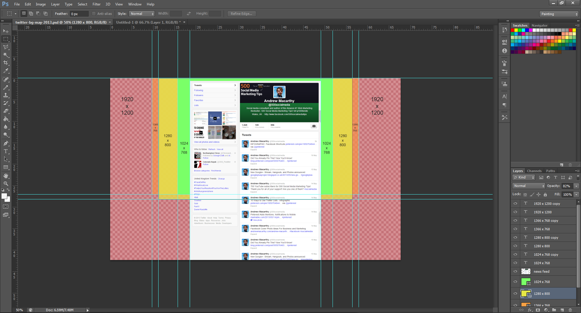
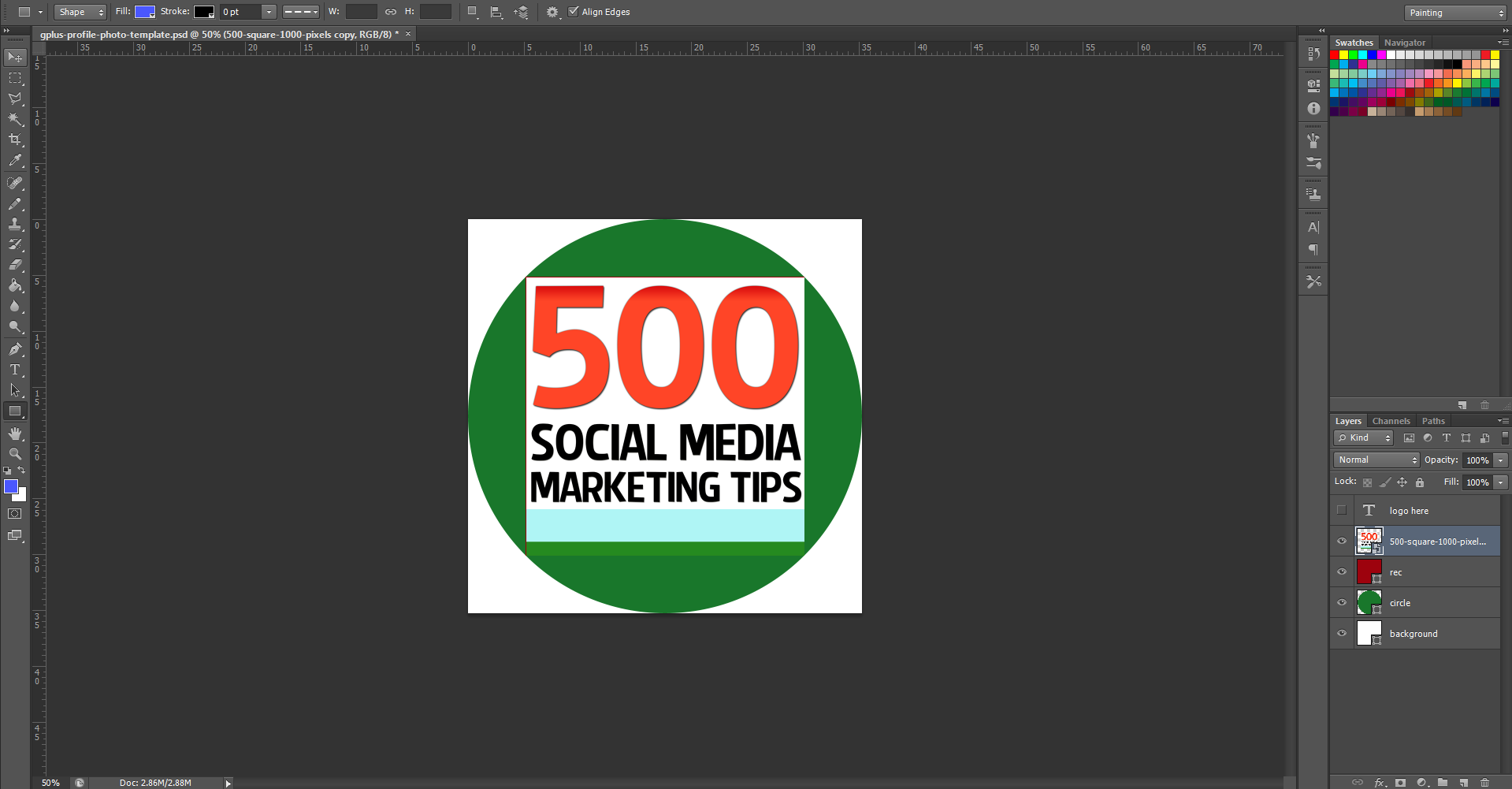
My Facebook cover and profile photo template for desktop and mobile users

facebook-cover-photo-template-desktop-and-mob-v3.jpg

Here it is, my template to help you create a Facebook profile and cover photo that is optimised for both desktop and mobile views:

  • The orange box represents the space covered by the desktop profile photo.
  • The blue box represents the space covered b the mobile profile photo.
  • The dark green box represents the general area covered by your Page's name and category on the mobile view.
  • The gradient emerging from the left represents the same gradient seen on mobile devices
  • The light green area represents the space where your design will be unobstructed

Examples of Facebook profile and cover photos optimised for desktop and mobile

bedbath.PNG

Taking both desktop and mobile views into consideration means that quite a lot of the cover photo's space is obstructed, but that does not mean you can't still have a great design, as long as you are creative. In the above example, Bed Bath & Beyond's cover and profile photo looks great on mobile, and its "Let's do brunch" slogan is unobstructed by any of the elements on the page.

photo (2).PNG

And here's my new cover and profile photo for mobile viewers. Using the template, I have made sure that my free ebook call to action is visible, and that nothing crucially important is behind where the huge square profile photo sits.

I think one of the most important points to make is that even though much of your cover photo is covered up - fully or partially - that doesn't mean that it still can't be visually appealing.

Download the template


This Facebook cover photo template (and several others for all the biggest social networks - expertly measured, simple to use, and up-to-date) is available instantly as a downloadable zip file via the purchase link above. For more information on all my social media templates, click here.

Note: Payment is fast and secure via PayPal, but you do not need a PayPal account to buy and download. 

Simply work around the template layers to add your design, save it as a .png file and upload it via the desktop Facebook site. Check how it looks on mobile, then tweak and re-upload if necessary. 


ABOUT THE AUTHOR
Andrew Macarthy is the author of the #1 Amazon Web Marketing Bestseller, 500 Social Media Marketing Tips, available for Kindle and in paperback.

Buy 500 Social Media Marketing Tips
Amazon US: http://www.amazon.com/dp/B007L50HE6
Amazon UK: http://www.amazon.co.uk/dp/B007L50HE6

Follow Me:
http://www.facebook.com/500socialmediatips/
https://pinterest.com/500socialmedia/
http://www.twitter.com/500socialmedia
http://www.youtube.com/500socialmediatips


How to Pin Images to Pinterest on iPhone App | How to Use Pinterest on iPhone

how-to-pin-to-pinterest-from-iphone-app.jpg

Pinning images to Pinterest from the iPhone was something of a faff before an update to the official Pinterest app in the spring of 2013. Now, it's much easier. Here's how: 

1.PNG

1. Make sure you've got an up-to-date version of the Pinterest app, and when you load it up, you'll see a "plus" icon in the middle of the home screen. Click that to begin the pinning process.

how-to-pin-to-pinterest-phone-app-2

2. You'll be given three options at this stage - Website (search for a website or enter a a website address where there is an image you want to pin), Camera (take a photo to pin), or Clipboard (paste in a website address that you have copied whilst browsing the web in Safari, Chrome, etc.)

how-to-pin-to-pinterest-phone-app-3

3. Once you're on the page that contains the image you want to pin, tap the "Pin it" button. 

how-to-pin-to-pinterest-phone-app-4

4. The Pinterest app will scan the page for pinnable images . Just tap the one that you want to pin. 

how-to-pin-to-pinterest-phone-app-5

5. With your image chosen, pick the board that you want to add it to (or create a new one by tapping the "plus" symbol), and that's it! You'll get a message to let you know that the image has been pinned successfully.


ABOUT THE AUTHOR
Andrew Macarthy is the author of the #1 Amazon Web Marketing Bestseller, 500 Social Media Marketing Tips, available for Kindle and in paperback.

Buy 500 Social Media Marketing Tips
Amazon US: http://www.amazon.com/dp/B007L50HE6
Amazon UK: http://www.amazon.co.uk/dp/B007L50HE6

Follow Me:
http://www.facebook.com/500socialmediatips/
https://pinterest.com/500socialmedia/
http://www.twitter.com/500socialmedia
http://www.youtube.com/500socialmediatips

Google Plus Profile Photo Template for Square Logos | FREE Download PSD Photoshop

Google Plus Doesn't Like Square Logos

In the first major design change to Google Plus earlier on this year, the social network's profile photos were changed from a square to a circle. While a circular shape works well for head and shoulder photos  of individuals and plenty of company logos, if your logo is a square shape - like mine for 500 Social Media Marketing Tips  is - then, by default, it doesn't fit... some proper squarelogoism going on from Google! As you can see from the examples in the image above, uploading a square logo sees it being cropped on all four corners, and it just looks messy. Even if you play around with the site's cropping or scaling tools, you really fix it.

The Solution: A Google Plus Profile Photo Template

As a work around to this problem, I have built a simple template for Photoshop or GIMP that will allow you to create and upload a square logo that fits inside    the default circular parameters, as in the image above. Of course, you stand to lose a smidgen profile photo "real estate," but what you gain is logo that will display without cropping on your cover photo, and next to every post and comment you make around the site.

The template is 1000 x 1000 pixels big - four times the minimum size that Google+ recommends - meaning your logo will enlarge into a nice, large image when clicked on from your page. 

How to Use the Template

When you first open the template, this is what you will see. The green circle represents the Google+ profile photo circle, while the red square shows the "safe" area in which you can add your square logo design. You've got some leeway in all four directions outside of the red square, but anything that passes into the white area will not be visible. So, first of all, hide my "Place your logo within this red square" layer and insert your logo on top of the red square layer instead.

Note: I have chosen a white background for this template to match and blend seamlessly the white of the Google+ layout, though you may choose to experiment with different colours if you wish.  If you delete the background and make it transparent, Google+ will not recognise it, and replace your image with a black background by default.

logo-in-square.PNG

Once you have inserted your logo, hide the red square layer and you'll have something like this. 

To finish, hide the green circle layer to remove all traces of the template, as above, and save your image as a PNG or JPEG file.

Uploading the Profile Photo

Visit your Google+ page and click on your existing profile profile photo to upload your new one in its place. When you select the file and it uploads, make sure to drag the cropping lines all the way out to the corners , as above. If you don't, your logo will not look right. When you're done, click the "Set as profile photo" button.

The Finished Result

google-plus-profile-photo-square-logo-in-circle-template.PNG

Here's that finished result once again. Hopefully yours will look very similar! 

Download the template

This Google+ template (and several others for all the biggest social networks - expertly measured, simple to use, and up-to-date) is available instantly as a downloadable zip file via the purchase link above. For more information on all my social media templates, click here.

Note: Payment is fast and secure via PayPal, but you do not need a PayPal account to buy and download. 

ABOUT THE AUTHOR

Andrew Macarthy is the author of the #1 Amazon Web Marketing Bestseller, 500 Social Media Marketing Tips, available for Kindle and in paperback.

Buy 500 Social Media Marketing Tips

Amazon US: http://www.amazon.com/dp/B007L50HE6
Amazon UK: http://www.amazon.co.uk/dp/B007L50HE6

Follow Me:
http://www.facebook.com/500socialmediatips/
https://pinterest.com/500socialmedia/
http://www.twitter.com/500socialmedia
http://www.youtube.com/500socialmediatips


Twitter Background Template PSD 2014 | 1920 x 1200 Photoshop Download


STOP! THE TWITTER LAYOUT HAS CHANGED AND THERE IS AN UPDATED BACKGROUND TEMPLATE AS OF APRIL 2014. CLICK HERE:

http://andrewmacarthy.com/andrew-macarthy-social-media/new-twitter-background-template-2014-psd-1920-x-1200-photoshop-download


free-twitter-template-2013-2014-psd-photoshop-1920-1200.jpg

NEW 2014 TWITTER BACKGROUND TEMPLATE NOW AVAILABLE: CLICK HERE.

Free Twitter Background Template Introduction

As with so many a hunt online for free social media templates, I couldn't find one for a Twitter background that provided everything I needed - specifically, a template that took into account how I might go about designing my Twitter background to cater for the many different resolutions at which it would be viewed on desktop screens (only the Twitter header, not the background can be seen on mobile devices). So, after lots of screen capturing, measuring, and testing, I designed my own and I'm giving it away for you to use too.  

I know this post is long and you're probably eager to just download the template and get started, but I urge you to have a quick read to understand how the template works and how it will help you design as good a background as possible. 

The Trouble With Twitter Background Branding

Twitter profile backgrounds are a a prime piece of real estate for brands, but creating one that is optimised to be seen as intended by as many users of the site as possible can be tricky due to the wide variety of screen resolutions that the site is browsed at on desktops. Problems include:

  • Design hidden behind news feed
  • Design looks different from one screen to another (brand message hidden)
  • Design not optimised for largest resolutions, leaving blank areas (see image above).

If you've had any of these problems, my free Twitter background template will help.  But, before we get to it, let's take a look at the relationship between Twitter, screen resolutions, and Twitter background designs so that you can use the template as effectively as possible. 

Explained: The Anatomy of A Twitter Page

twitter.png

No matter what resolution people view Twitter on their desktop monitor, the news feed - which is always 865 pixels wide - will always sit in the centre of the page. That leaves an equal amount of space either side of it for visible background design (the rest being hidden behind the news feed itself). How much of the design is visible by a user, then, depends on the resolution of their display.

Therefore, in designing your Twitter background, you should aim to cater to as many people using as many different resolutions as possible, especially if you want branding on either side of the feed that isn't just a plain or patterned background (promotions, slogans, product images, etc).

Global Stats For Screen Resolutions

st.JPG

According to the most recent global statistics, the most popular screen resolution for viewing the web is 1366 x 768 pixels (around 24% of the total) followed by 1024 x 768 (around 16%). From these stats (and those for less common sizes), we can deduce that for the vast majority of people viewing your Twitter profile will be able to view a background design optimised for a 1366 x 768 pixel resolution. Anything designed for bigger resolutions will be wasted on the majority of users.

Using the Template to Cater for the Majority

twitter-background-template-psd-2013-photoshop.png

Now, let's look at the template I have designed. For display resolutions of 1024 x 768 pixels, 1280 x 800 pixels, and 1366 x 768 pixels (represented by the green, yellow and orange boxes in the cropped image of the template above), the amount of your background design that will be visible on either side of the news feed is 66 pixels, 194 pixels, and 238 pixels respectively. 

Optimising Your Twitter Background Design

The biggest resolution people are likely to view Twitter at is 1920 x 1200 pixels, so the template is offered at this size and I urge you to design with people viewing at this resolution in mind, but optimised for the majority who only see up to 1366 x 768 pixels, i.e. when using the template, put your most important branding elements - logo, products, offers, URLs within the orange box. View the gallery above for examples of how the Twitter background will appear for users at different resolutions. 

Of course, while 1366 x 758 is the most popular screen resolution for now, this is likely to change in future and so you may want to change your Twitter template with it.

How to Use the Twitter Background Template

twitter-background-template-photoshop.png

When you open up the Twitter Background template in Photoshop or GIMP, it will look like the image above. Work above and/or hide the layers representing the Twitter news feed and screen resolutions, then remove them all before saving your design as a PNG before uploading it to Twitter. Remember to work using the whole space, but optimize your design for 1366 x 758 pixel resolutions.

Note: The Twitter navigation bar does not appear in the template. This sits above your background when it is uploaded, not on top of it.  And while every effort has been taken to make this template as accurate as possible, prepare yourself for minor tweaking of your background design elements if necessary. Test and tweak is the name of the game!

One Last Thing - Centre Your Background!

center-twiter-background.JPG

Twitter backgrounds are left-aligned by default, but this template is designed for optimal viewing on all resolutions when the background is centred, so make sure to switch to this option when you upload, as shown above. 

Download the Twitter Background Template


This Twitter template (and several others for all the biggest social networks - expertly measured, simple to use, and up-to-date) is available instantly as a downloadable zip file via the purchase link above. For more information on all my social media templates, click here.

Note: Payment is fast and secure via PayPal, but you do not need a PayPal account to buy and download.  it!


5 Things You Must Do to Prepare For the New YouTube One Channel Layout 2013

new-youtube-one-channel-layout.jpg

The new YouTube One Channel layout has been available for a month or two now, but only on an opt in basis. Over 100 million users have already made the switch, but from June 5th, all channels will be automatically and permanently moved to the new design, whether they're ready for it or not! The last thing you want is for your channel and its branding to look out of sorts when the switch happens, so here are 5 Things You Must Do to Prepare For the YouTube One Channel Layout. These simple steps to get yourself ready ahead of time and take advantage of the benefits of the new layout as soon as possible.

1. Opt In Now

opt-in.JPG

To be ready before the automatic switchover (and make use of the next four pointers), opt in to the YouTube One Channel layout now by visiting http://www.youtube.com/onechannel. Have a read through the overview provided if you wish, bid farewell to your old channel layout one last time, then hit the button at the bottom of the page to upgrade.

2. Upload A Channel Icon

500socialmedia-1354822281_600.jpg

Once you're upgraded, upload a square, high-resolution (800px x 800px) image for your channel icon; a pic that is also recognisable at smaller resolutions. This image will be your channel’s icon all over YouTube - in search results, comments, and on your Channel Art (explained next).

3. Upload Channel Art

youtube-channel-art-example.JPG

The One Channel design ditches the background branding of old and opts instead for a simple cover image known as your Channel Art. Your YouTube channel's icon sits on top of it, and you can also add clickable icons to your website and social media profiles. To get started, hover over your channel art place holder and click the pencil icon that appears in the top-right corner. In the drop-down menu, click "Edit Channel Art" and "Edit Links" respectively.

The most effective YouTube Channel Art is an image that is optimised to display well on whichever resolution it is being viewed. To ensure yours looks great on screens from mobiles to HD televisions, use the guidelines in my template, which you can download here: Social Media Templates Page

4. Create A Channel Trailer


The new YouTube channel pages have two primary ways of displaying video content in the Home tab: through the Browse view or through the Activity Feed. The Activity Feed broadcasts your activity on YouTube to your subscribers, while the Browse view two different "sub-views": a view for subscribers, and a view for viewers who have not yet subscribed to your channel. For this reason, the Browse view is my preferred default, but it needs to be enabled first. Here's how:

1. Hover your cursor over the menu bar that contains the 'Video', 'About', and 'Discussion' tabs on your Channel Page.

2. Click on the pencil icon that appears to open the Channel Navigation menu.

3. From here, click the button to enable the Browse feed, and then click Save. Go back to your Channel page and you'll be able to add a trailer over a place holder.

For instructions about how to create a great channel trailer to entice in new subscribers, watch my tutorial video above. 

5. Add Sections

sections.JPG

Sections are a way for you to organise your videos into groups on your channel page, and they can either be built manually or created dynamically from video tags, likes, etc. Use sections to highlight your best content, both to subscribed and non-subscribed viewers. To begin, scroll to the bottom of your channel page and click the "Add a section" button.

Conclusion

So there you have it, a handful of simple and effective ways you can help make your brand's transition to the YouTube One Channel layout as painless as possible, and hopefully increase your audience at the same time. What are your thoughts on the new YouTube layout? Let me know in the comments below!