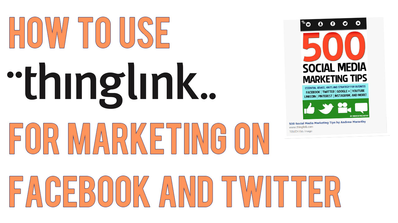
Facebook Page Review: Glastonbury Drums

Glastonbury Drums

As part of my Free Facebook Page Review promotion over at the 500 Social Media Marketing Tips Facebook Page, I selected Glastonbury Drums as the second of three free reviews. Kyle Cullen offers drum lessons in Somerset, England, as well as online lessons via Skype. Here's my analysis of his current Facebook Page, along with tips and recommendations for how I think it could be improved. 

Page Name and URL

search.png

Kyle has got his Page name and URL spot on. He is the only result to appear in a search for 'drum lessons glastonbury', thanks to the name of his page, his vanity URL (http://www.facebook.com/GlastonburyDrums) and also having filled in his location information. Sweet!
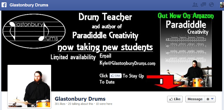
cover.PNG

Cover Photo
Kyle's Facebook cover photo is 881 x 326 pixels; the recommended size is 850 x 351. While optimising the cover photo size in this instance doesn't make a hugedifference to the way it displays on Facebook, sticking to the recommended dimensions does mean that you know exactly how it will display when it is uploaded, and also enables the use of a template to build the cover photo precisely around the position of the profile photo, which overlaps it in the bottom left-hand corner.

Design-wise, Kyle's cover photo isn't as engaging as it could be; I feel it's a bit dark and gloomy for something exciting as drum lessons, and the text makes it too busy to make a real impact.  Facebook's "no more than 20% text on the cover photo" rule is exceeded. A call to action asking people to like the page is sometimes a good idea, but the message 'to stay up to date' is vague, and I feel that if people want to 'like' a page, they will do so without prompting. My personal opinion is that cover photo design should have a "less is more" approach, with details such as e-mail address and telephone numbers - or any great amount of text - saved for the About section.

Profile Photo
As Kyle is the figurehead of his company, I feel that his profile photo should be used as an opportunity to connect with his audience, both on his Facebook Page and across the site in comments sections and posts. One of the best ways to do to this is to choose a head-and-shoulders photo. Kyle's current profile photo shows who he is and what he does, but he's too small and too far away for us to get a good look without clicking on the image to see it in full.   

coverpic-new.jpg

Here is a mock-up of a potential new look for Glastonbury Drums' Facebook cover photo and profile photo. The design is bright and simple, and more fully reflects the fun that people will have learning to play drums with the company. The big image of a drum kit instantly communicate what the page is all about, and we've got the company logo (now black instead of white) above a clear snippet of text to let users know what Kyle offers - "One-to-one lessons in Somerset or online via Skype). The profile photo is a close-up of a happy and smiley Kyle, which beams warmth and instantly connects with potential customers. As per Facebook recommendations, it's also a square that fits the profile perfectly. I used my Facebook Cover Photo Template to line up and design everything as nicely as possible.

About Section

There are a lot of great details on Glastonbury Drums' About page - most notably, a working map with phone, e-mail, and company website, which help people find the business easily, and also optimise the Page for Facebook mobile users, allowing them to Check In and leave Recommendations. Here are some suggestions for what I would change: 

  • I would amend the synopsis of the page slightly, to mirror the cover photo, telling users that drum lessons are offered one-on-one in Glastonbury, or online via Skype.
  • I would suggest using the Description section as a way to more fully introduce people to Kyle and Glastonbury Drums, similar to the About Me page on the Glastonbury Drums website, but would leave out any links to your books for the Product section.  You could also include some basic pricing information here.
  • I would include some detail about the types of drum lessons offered, and the pricing. 
  • Don't forget to include all relevant information in Contact Info section.  Fill out as much of the about section as possible for SEO purposes.

Here's an example of how the Description of the About section could read: 

I’m Kyle Cullen, a CRB checked and accredited Drumsense tutor and author, based in Glastonbury, Somerset.

I teach a variety of styles and techniques and will have you playing a beat in your first lesson.

I also run a recording studio and rehearsal studio in Glastonbury for more details check out www.chickenshedstudio.co.uk

My students range from complete beginners to experienced musicians.

Custom Tabs

custom-tabs.PNG

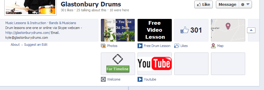
Kyle has made a good start with his Facebook Page's custom tabs, but I think there is a really good opportunity to use them more powerfully, both to tell people more about him and advertise his wares. At present, not all of the tabs are branded with custom images, and others do not appear to work at all.

freevideolesson2.PNG

Here is the 'Free Drum Lesson' tab. I really like the idea of asking people to sign up via e-mail to gain access to the lesson, but I don't think the tab is really dynamic or persuasive enough to make people want to subscribe. With a more detailed design, Kyle could explain what the Free Drum Lesson included, and even a video to introduce potential customers to what they will be getting.

metab.PNG

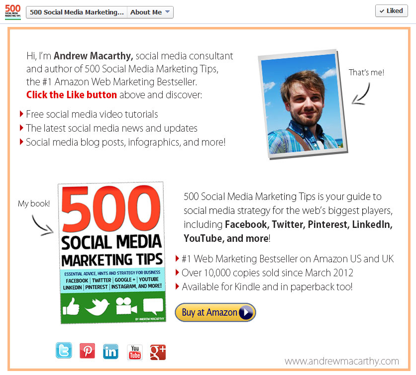
Similarly, Kyle could use other custom tabs to tell people about himself, his products and pricing, and also promote his Page and books like I have done for my page in the example above. 

full-mockup.jpg

Here's a rough mock-up of how the Page would look with new custom tabs, complete with custom images and custom tab titles. They're all big, bright, and clear, and match the branding of the cover photo too.

Types of Posts and Frequency

sticks.PNG

Posting a variety of content on a regular basis is so important to keep your fans engaged and give potential new fans the impression that your Page is active with great posts, encouraging them to stick around with a 'Like', some kind of interaction, or even turn into a new lead. 

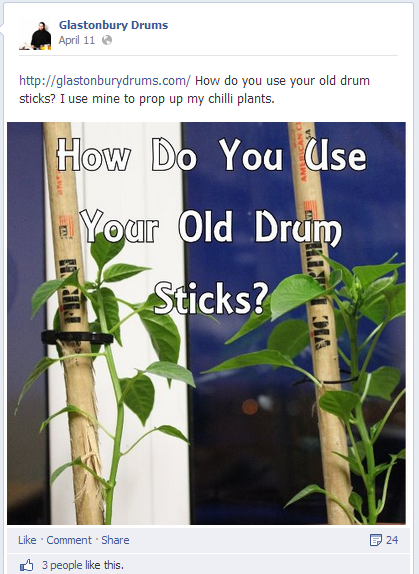
Kyle's posts are a good mix of free drum lesson content, videos, images, and interesting links, all delivered with good humour and charm. And pleasingly, there's the odd sprinkle of promotional material in there too, but as it should, these are kept to a minimum. Here are a couple of ideas to enhance the Page's posts:

  • My main suggestion would be to up the consistency of posting to at least once or twice per day, and perhaps to also include more content specifically about the drum lessons and studio. If they were willing,
  • To encourage his current pupils to visit the Page often, he could post photos and multiple choice questions up about drum or music theory. At the end of the week or a month, he could select a winner to receive a little prize.
  • Kyle could post photos or short video clips of his pupils. This would give customers a glimpse into his studio setting and seeing other people enjoying his lessons would help convince them to sign up for some too.
  • I think a really interesting feature could be 'Before' and 'After' clips to show just how much pupils are able to develop their drumming technique under Kyle's guidance. Kyle could also feature the odd customer testimonial on his Facebook Page, as he has already done on his website.

Basic Competitor Analysis

bigbang.PNG

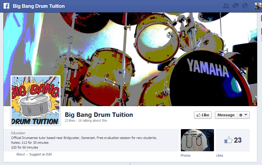
Big Bang Drum Tuition (https://www.facebook.com/Bigbangdrumtuition)
This company appears to be Glastonbury Drums' closest (and only?) rival in the nearby vicinity. However, their Facebook Page branding is not terrific,  they have an inconsistent posting schedule, no custom tabs, and the About section lacking.

Conclusion

All in all, I believe Glastonbury Drums, with a few changes to its Facebook Page design and content, has a fantastic opportunity to become a hub for would-be drummers in the area, and in terms of a well-run, professional-looking Facebook Page, blow its main competitor out of the water! As I imagine a lot of Kyle's students are young people, they are the perfect audience to encourage to interact with the page, help spread the word, and attract new custom. 

For more information about Kyle and the drum lessons he offers, check out his Facebook Page and website at the following links: 

https://www.facebook.com/GlastonburyDrums
http://www.glastonburydrums.com/

 Want A Facebook Page Review?

If you'd like me to help you with your Facebook Page, and want a customised review similar to the one above, check out the Facebook Page Review Service section of my website for full details and to purchase for a launch price of only $49.


Social Media Templates 2014, 2015 PSD | Facebook, Twitter, Google Plus, YouTube One Channel

 
social-media-templates-2013-2014.jpg

Introduction

I've previously posted several social media templates in individual blog posts, but I think it would probably be more handy for you guys to be able to grab them all in one spot. This also means that I can easily update the templates and links should the designs change - as we know they often do!  

The templates for Facebook, Twitter, Google+, and YouTube are in the .psd file format, which can be opened and edited in Photoshop or GIMP (a free photo editing program).  Each template includes simple instructions for where your design should be placed in order to be viewed optimally on each site.  

Want me to build and design your social profiles? 

Even with the templates below, I understand that designing and building great social media branding can be tricky, especially if you have never used Photoshop or don't have the time to do the work due to a busy schedule... that's where I can help!

If you'd like me to create your social media branding for Facebook, Twitter, YouTube, and more, purchase via PayPal below (no PayPal account required) or get in touch via the Contact Me page. I'll get back to you shortly afterwards to find out about your requirements.


Purchase Options

Facebook Cover Photo Template

facebook-cover-photo-template-2.jpg

This is the basic Facebook cover photo template. It'll help you create a design that is optimised for desktops and ensure that your profile photo doesn't obscure any of your design's most important information. For more information and detailed instructions for using this template, click here

Facebook Cover Photo Template Optimised for Desktop and Mobile


This template takes into account the appearance of cover photos and profile photos on the Facebook mobile app and is recommended for those who want to super optimise their Facebook Page. For more information and real-life examples, click here.

Twitter Background Image Template

To get the most out of the Twitter Background Image template, i.e. to optimise it for viewing by all Twitter users, I urge you to read this blog post before downloading:  http://andrewmacarthy.com/andrew-macarthy-social-media/free-twitter-background-template-psd-2013-1920-x-1200

Twitter Header Image Template

This template will help you brand your Twitter header photo without having any of your most important design elements be hidden by your profile photo, name, bio, etc. Simply add your design to the grey areas and remove all of the template layers before saving. If you would like to create a seamless header and profile photo on Twitter, click here for instructions:   

Google Plus Cover Photo Template

The Google+ cover photo is massive! This template has the correct dimensions for you and a guide (the green bar) to make sure that none of your design is hidden by a dark grey gradient added to the bottom of all cover photos on Google+. 

Google Plus Profile Photo Template for Square Logos

Google+ doesn't like square logos. Getting one to upload properly is a bit of a nightmare, but this template will help you upload one without it being cropped or chopped off by the default circular profile photo. For more information and step-by-step instructions on using the template, click here


YouTube One Channel Template

This YouTube template will help you create channel art optimised for all devices, from mobile phones all the way up to HDTVs. The different-coloured rectangles represent how much of the design each device will see, while the coloured squares represent the position of your channel icon on different devices. Have your design fill the whole space, but remember that only content in the brown area will be seen by everyone on every device.  For detailed instructions about how to use this template, click here.

Download these templates

All of these templates - expertly measured, simple to use, and up-to-date) is available instantly as a downloadable zip file via the purchase link above. For more information on all my social media templates, click here.

Note: Payment is fast and secure via PayPal, but you do not need a PayPal account to buy and download. 


ABOUT THE AUTHOR

Andrew Macarthy is the author of the #1 Amazon Bestseller, 500 Social Media Marketing Tips.

Buy 500 Social Media Marketing Tips (Kindle or Paperback)
Amazon US: http://www.amazon.com/dp/B007L50HE6
Amazon UK: http://www.amazon.co.uk/dp/B007L50HE6

Follow Me:
http://www.facebook.com/500socialmediatips/
https://pinterest.com/500socialmedia/
http://www.twitter.com/500socialmedia
http://www.youtube.com/500socialmediatips

How to Use Thinglink For Marketing on Facebook and Twitter

 
how-to-use-thinglink-for-marketing-facebook-twitter.jpg

This week, Thinglink, a site that allows users to create free, interactive images launched its full service on Facebook (it's been available on Twitter for a while now too). For brands, this means that they can share images to their Facebook Page Timelines that can include multiple, clickable links to any external URL, e.g. your website and its products, YouTube Channel, Twitter profile, etc..  In this blog post, I'll show you step-by-step how to create an interactive image on Thinglink and demonstrate how it functions on Facebook.

1. Sign up for a free account at Thinglink  and click on the Create button.

2. Upload the image you want to use, import it from Facebook or Flickr, or grab it using a web link.

3. Click on the image to add a 'tag'; tags are the interactive, clickable icons that will appear on top of your image. 

4.PNG

4. On each tag, you can specify a URL and add a description that will appear when someone hovers over it with their cursor.

5.PNG

5. Also click to choose an appropriate tag icon. 

6.PNG

6. Click and drag the tag to re-position it. Be aware that the tags are all white, so might not be seen so easily on a very light background.

7.PNG

7. Add as many tags as you wish, add an image title and click Save. Leave the 'Make image unlisted' and 'Allow anyone to edit' check boxes blank.

8. Click the Share button to post your image on a variety of social networks, or by e-mail. Images shared to Facebook or Twitter will be interactive within your Timeline and users' news feeds, but other sites will just provide a link to view your creation on Thinglink.

9. Here's how your Thinglink image appears when it is shared to your Facebook Timeline. Make sure to instruct your fans to click on it to interact.

10. And here how the image displays once clicked, with fully interactive icons and their descriptions.

Conclusion

There's a few things I'd like to see improved on Thinglink - notably an ability to change the colour of link icons, to make positioning the icons more exact, and an easier way to embed interactive images to websites - but otherwise, I am very impressed. As well as promoting the odd product to your fans and followers, it can be used as a way to group several themed links together in one image. 

Will you be giving Thinglink a go? Let me know in the comments below! 


ABOUT THE AUTHOR

Andrew Macarthy is the author of the #1 Amazon Bestseller, 500 Social Media Marketing Tips.

Buy 500 Social Media Marketing Tips (Kindle or Paperback)
Amazon US: http://www.amazon.com/dp/B007L50HE6
Amazon UK: http://www.amazon.co.uk/dp/B007L50HE6

Follow Me:
http://www.facebook.com/500socialmediatips/
https://pinterest.com/500socialmedia/
http://www.twitter.com/500socialmedia
http://www.youtube.com/500socialmediatips

5 Ways to Use YouTube Annotations Like A Pro | Use YouTube Annotations Effectively

 
​5 Ways to Use YouTube Annotations Like A Pro #youtube #socialmedia

​5 Ways to Use YouTube Annotations Like A Pro #youtube #socialmedia

YouTube Annotations can be a great way improve your video content on the site, whether that be to add an extra layer of detail, to entertain, or to add a clickable call to action. Not all annotations, however, are created equal. Here are five ways to optimise the use of yours, in a way that will enhance your viewers' enjoyment of your videos, instead of turning them away. 

Note: The annotation examples below are demonstrated on top of some of my 'home video' content, but the principles easily apply to business and marketing content.

1. Annotation Duration

youtube-annotation-duration.PNG

Annotations can be displayed on top of a video for as long a time as you choose, and while they can be manually closed by the viewer, you don't want to have to make them resort to this as it will disrupt their viewing experience. Therefore, aim to have your annotations appear onscreen for only as long as it takes to read them. In most cases, this will be no longer than 5-7 seconds.

2. Annotation Size

youtube-annotations-size.PNG

By dragging the edges of your annotation in the editor, you can make them as big or as small as you like. Just because you can make an annotation cover the whole of the screen, however, doesn't mean you should! While you'll want it to be seen, the mere action of it popping up onscreen is enough for the majority of people to notice it. Try to keep your annotations as small and unobtrusive as possible, and also refrain from typing their content in ALL CAPS, as this approach can be considered rude and "shouty" online.

3. Annotation Colour

youtube-annotation-color.PNG

YouTube allows you to set the background and text colour of your annotations, but unless the content of the message is absolutely critical to the video (like explaining a detail you forgot to include during recording), their hues are best left subtle. Bright colours like red, yellow, and green are attention-grabbing, but pale and transparent colours are much classier and are much less likely to spoil a viewer's enjoyment of your video. In short, annotations do not always have to take centre stage.

4. Annotation Placement

youtube-annotation-placement.PNG

As in some of the points above, annotation placement is all about them being as unobtrusive as possible - not like the example above, which completely ruins a cute shot of Jenny the cat! The best placement for annotations is at the left and right sides of the video, near the top of the bottom. Avoid placing annotations in the lower third of the video, as there is a chance that they will be obscured by overlay adverts. 

5. Annotation Numbers

youtube-annotations-number.PNG

In short, the fewer annotations your video needs, the better. If your video ends up looking like the example above, it is bound to be a turn-off for your viewers - displaying multiple annotations at once can be distracting and confusing. There's one exception to this rule, however, and it's one I employ on the "end screen" of my videos. Here, I give viewers to either click a Subscribe button, or to click through to my previous video. 

Conclusion And Over to You

So there you have it, five simple tips for YouTube annotations that won't only enhance your videos, but also ensure that the viewing pleasure of your audience is kept at as high a level as possible. Do you have any other tactics for the optimum use of annotations? Let me know in the comments below! 


ABOUT THE AUTHOR

Andrew Macarthy is the author of the #1 Amazon Bestseller, 500 Social Media Marketing Tips.

Buy 500 Social Media Marketing Tips (Kindle or Paperback)
Amazon US: http://www.amazon.com/dp/B007L50HE6
Amazon UK: http://www.amazon.co.uk/dp/B007L50HE6

Follow Me:
http://www.facebook.com/500socialmediatips/
https://pinterest.com/500socialmedia/
http://www.twitter.com/500socialmedia
http://www.youtube.com/500socialmediatips

Facebook Cover Photo Template PSD 2013 | Facebook Cover Image Template Photoshop

I don't know what it is about finding an easy-to-use Facebook cover photo template online, but none of the ones I was finding in Google's most popular search results were hitting the spot for me. So here's my offering; a super simple PSD template to help you design an image that will perfectly represent your brand on the site - no blurry photos or dubious cropping in sight.

Want me to design and build your social media layouts?

Even with the templates below, I understand that designing and building great social media branding can be tricky, especially if you have never used Photoshop or don't have the time to do the work due to a busy schedule... that's where I can help!

If you'd like me to create your social media branding for Facebook, Twitter, YouTube, and more, please get in touch via the Contact Me page today with your requirements, and I'll get back to you shortly afterwards. 

facebook-cover-photo-template.jpg

Facebook cover images are 851 pixels wide and 315 pixels tall. The template's green layer is this size. Just work above it in a new layer and delete the green rectangle when you are finished. Beware, however, of the orange square. Facebook profile photos noticeably iminge on the 851 x 315 px rectangle, so you'll have to work around it and make sure nothing too crucial image-wise is sitting behind it. 

facebook-cover-image-photo-template-psd.PNG

When you're all done desiging, delete every layer except your new cover design, then save it as a .png or .jpg file to upload to Facebook.  As you can see from the example above, the green cover photo rectangle fits perfectly, and the Profile Pic square is hidden behind the actual (overlaid) profile photo square.

minus-dl.jpg

Download the Facebook Cover Photo Template


This Facebook cover photo template (and several others for all the biggest social networks - expertly measured, simple to use, and up-to-date) is available instantly as a downloadable zip file via the purchase link above. For more information on all my social media templates, click here.

Note: Payment is fast and secure via PayPal, but you do not need a PayPal account to buy and download. 

Alternatively, buy a copy of my #1 Web Marketing Bestselling book500 Social Media Marketing Tips,  on Kindle or in paperback, and receive a link to download them all for free - you'll find it located in the Social Media Templates chapter. 


ABOUT THE AUTHOR

Andrew Macarthy is the author of the #1 Amazon Kindle Bestseller, 500 Social Media Marketing Tips.

Buy 500 Social Media Marketing Tips
Amazon US: http://www.amazon.com/dp/B007L50HE6
Amazon UK: http://www.amazon.co.uk/dp/B007L50HE6

Follow Me:
http://www.facebook.com/500socialmediatips/
https://pinterest.com/500socialmedia/
http://www.twitter.com/500socialmedia
http://www.youtube.com/500socialmediatips