
Video: Free Facebook Cover Photo Template Photoshop PSD
/Download the template
This Facebook template (and several others for all the biggest social networks - expertly measured, simple to use, and up-to-date) is available instantly as a downloadable zip file via the purchase link above. For more information on all my social media templates, click here.
Note: Payment is fast and secure via PayPal, but you do not need a PayPal account to buy and download.
Simply work around the template layers to add your design, save it as a .png file and upload it!
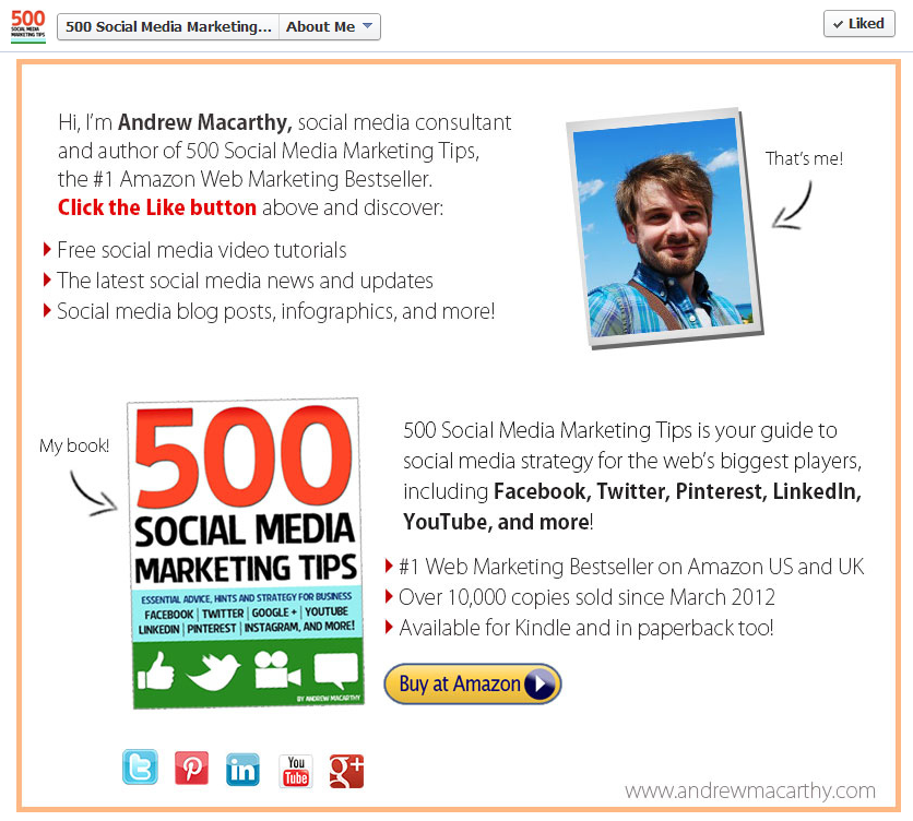
ABOUT THE AUTHOR
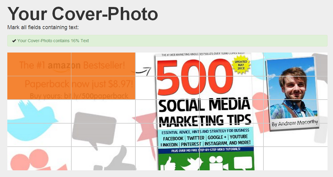
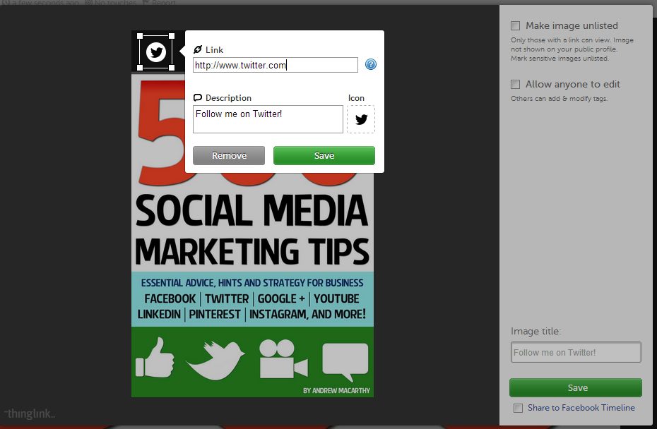
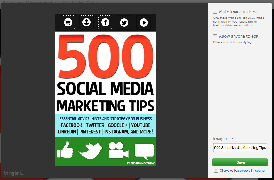
Andrew Macarthy is the author of the #1 Amazon Bestseller, 500 Social Media Marketing Tips.
Buy 500 Social Media Marketing Tips (Kindle or Paperback)
Amazon US: http://www.amazon.com/dp/B007L50HE6
Amazon UK: http://www.amazon.co.uk/dp/B007L50HE6
Follow Me:
http://www.facebook.com/500socialmediatips/
https://pinterest.com/500socialmedia/
http://www.twitter.com/500socialmedia
http://www.youtube.com/500socialmediatips